The Importance of Responsive Web Design in 2025
Discover how responsive web design enhances user experience, boosts SEO rankings, and prepares your website for the future digital landscape in 2025
In the rapidly evolving digital landscape of 2025, responsive web design (RWD) has become more crucial than ever. With a multitude of devices available, ensuring your website adapts seamlessly to various screen sizes is essential for delivering an optimal user experience and improving search engine rankings.
What is Responsive Web Design?
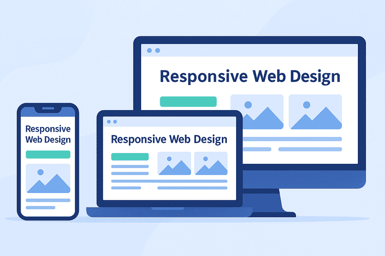
Responsive web design is a development approach that allows your website’s layout, images, and functionalities to automatically adjust and optimize themselves for any device or screen resolution. This means users enjoy a consistent, intuitive, and visually appealing experience whether they’re browsing on a mobile phone, tablet, laptop, desktop, or even a smartwatch.
Key Elements of Responsive Web Design
- Fluid Grids: Layouts that use relative units (like percentages) instead of fixed pixels, allowing content to scale smoothly.
- Flexible Images: Images that resize within their containing elements to prevent overflow or distortion.
- Media Queries: CSS techniques that apply different styles based on device characteristics, such as screen width, resolution, or orientation.
- Mobile-First Approach: Designing for the smallest screens first and progressively enhancing the experience for larger devices.
Benefits of Responsive Web Design
- Superior User Experience: Users enjoy smooth navigation, easy readability, and intuitive interactions on any device, increasing satisfaction and time spent on your site.
- SEO Advantages: Search engines like Google prioritize mobile-friendly, responsive sites, which can significantly boost your rankings and organic traffic.
- Cost and Time Efficiency: Managing a single responsive website is far more efficient and cost-effective than maintaining separate versions for desktop and mobile.
- Future-Proof Flexibility: Responsive design ensures your site remains compatible with new devices and screen sizes as technology evolves, reducing the need for frequent redesigns.
- Faster Load Times: Optimized images and adaptive layouts contribute to quicker load times, which is crucial for both user satisfaction and search rankings.
- Increased Conversion Rates: A seamless, consistent experience across devices leads to higher engagement, trust, and ultimately, more conversions or sales.
Best Practices for Responsive Web Design in 2025
- Prioritize Mobile Performance: Optimize images, use modern formats (like WebP), and minimize code to ensure fast load times on mobile networks.
- Test Across Devices: Regularly test your site on a wide range of devices and browsers to catch and fix any inconsistencies.
- Embrace Accessibility: Ensure your responsive design is accessible to all users, including those with disabilities, by following WCAG guidelines.
- Leverage Modern Frameworks: Utilize up-to-date CSS frameworks (like Bootstrap 5 or Tailwind CSS) and JavaScript libraries that support responsive features out of the box.
- Continuous Monitoring: Use analytics and user feedback to identify pain points and opportunities for improvement in your site’s responsiveness.
Conclusion
Embracing responsive web design in 2025 is not just about aesthetics; it's a strategic approach to enhance user satisfaction, improve SEO rankings, and ensure your website remains effective and accessible in an increasingly mobile world.
